Wyylde
Redesigning a large social platform during a strategic pivot.
- Role
- Product Designer
- Duration
- 2024 — 2026
- Team
- 3 dev teams · Product · 2 designers
- Tools
- Figma · Storybook · Amplitude · Hotjar · Screeb
Company
Wyylde is a leading European social platform for liberated sexual encounters — a safe, inclusive, judgment-free space.
72% Rebranding adoption · +80% Profile completion · 2.9 → 3.5 User satisfaction · +2pt Conversion · +9.5pt DAU — shipped to production across 5 European markets.
My role
Product Designer — embedded across 3 product teams.
- /01Ownership of social experiences end-to-end: Profile, Feed, Messaging, Live Video, Media.
- /02Partnered daily with Product Managers, developers and 2 designers across 3 cross-functional teams.
- /03Shaped the strategic pivot to a social-media-first product alongside leadership.
- /04Co-built the design system in Figma + Storybook with the front-end team — reducing design debt and unblocking parallel delivery.
Context & Challenge
Wyylde ran a major rebrand with Dragon Rouge to reposition the product as a social, community-driven platform — not just a dating app.
The product challenge:
- /01Translate a new brand into a coherent product experience on live traffic.
- /02Redesign core flows without disrupting the existing member base.
- /03Lift usability, engagement and consistency across mobile and web.
- /04Establish a scalable design system to support future iteration.
Scope of the Redesign
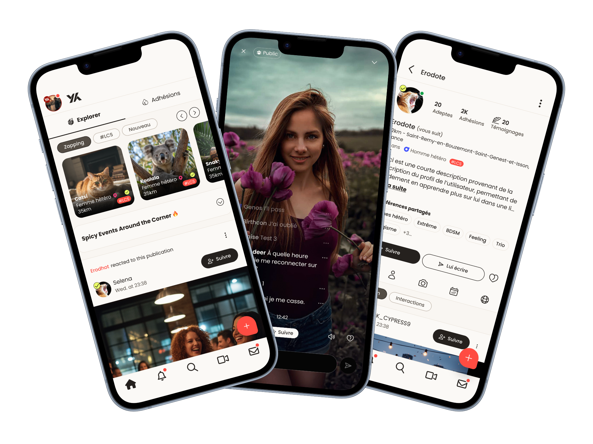
The rebranding involved a complete redesign of the following key areas:
- /01Home — Discover recent activities and community content.
- /02Profile — Explore users, assess compatibility, and initiate interactions.
- /03Lives — Stream and watch live video content.
- /04Messages — Communicate seamlessly across different interaction contexts.
Goals
- /01Align the product experience with Wyylde's new brand and positioning.
- /02Modernize the interface to match current social media standards.
- /03Improve clarity, engagement, and accessibility across the app.
- /04Support long-term scalability through a robust and shared design system.
Design System
The design system was built collaboratively with the front-end team and two designers using Figma and Storybook.
It enabled:
- /01Faster and more consistent front-end delivery.
- /02Reduced design and technical debt.
- /03Better alignment between design and development teams.
- /04Easier scaling of new features and iterations.
Data-Driven Iteration
Throughout the redesign, we continuously monitored user behavior and satisfaction using:
- /01Amplitude for behavioral analytics.
- /02Screeb for qualitative feedback and in-app surveys.
This allowed us to iterate quickly and validate design decisions based on real user data.
Focus Case — Profile Experience Redesign
Profiles are the most-trafficked surface on Wyylde — first impressions, engagement and connections all flow through them.
As the product pivoted toward a social-media model, the existing profile couldn't carry it. It needed to load faster decisions for visitors and let members express more.
Key Pain Points
- /01Lack of clear information hierarchy.
- /02Disjointed and inconsistent navigation.
- /03Poor visibility of key interactions, especially on mobile.
- /04Overloaded and cluttered media presentation.
- /05Low completion rate.
Strengths
- /01Rich user information enabling deep self-expression.
- /02Multiple interaction options (messages, likes, testimonials).
- /03Display of followed groups and pages encouraging discovery.
- /04Availability and event information supporting contextual connections.
Data Analysis
Using Hotjar heatmaps, we identified key user behaviors:
Strong focus on visual content — 30% of clicks on the "Medias" tab.
Secondary interest in social proof and information — "Testimonials" (6%), "Infos" (4.8%).
Low interaction with key actions — "More" (4.42%), "Send a message" (4.31%), suggesting visibility or relevance issues.
Design Goals
To align the profile page with Wyylde's new positioning, we focused on:
- /01Clear and accessible interactions (mobile-first).
- /02Important information visible at a glance (common interests, short bio).
- /03Media-first layout emphasizing photos and videos.
- /04Intuitive and simplified navigation.
- /05Clear display of followers and interactions to reinforce social proof.
- /06Improve completion rate.
Key Design Decisions
- /01Media-first profile layout reflecting user priorities.
- /02Prominent social proof (followers, interaction metrics), especially on mobile.
- /03Highly visible primary actions (message, follow, like).
- /04Simplified navigation for faster exploration.
- /05Mobile-first interaction patterns aligned with social media standards.
- /06These decisions helped transform profiles into more expressive, engaging, and interaction-driven experiences.
- /07Add a completion system with reward for high percentage of profile completion.
Outcome
Source — Metrics collected through Amplitude and In-app surveys using Screeb.
Key Learnings
- /01On social products, visual content drives engagement — layout decisions follow from that.
- /02Simplifying primary actions on mobile moves the metric more than adding features.
- /03A shared design system is the unlock for shipping at this scale with 3 dev teams in parallel.
- /04Data-informed decisions (Amplitude + Screeb) cut debate cycles and aligned product, design and engineering.